New responsive feature for S&D websites

|
|
|
|
|
We are pleased to inform you about some new features and upgrades introduced in recent weeks.
Responsive feature - S&D Interface
Due to insistent demand from our customers who manage their website with the Store & Directory interface, following the latest mobile responsiveness warnings issued by Google, we have developed the responsive feature for S&D websites, in addition to our Web App version.
The present update is irrelevant for Express Website Builder users, since it refers to the Store & Directory system only.
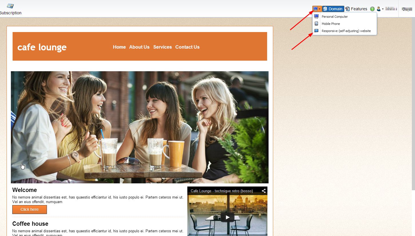
In order to enable mobile responsivity in your website, enter the management panel >> click the computer icon next to the Domain button >> select the "Responsive (self-adjusting) website" option.
In case you are already using the Web App option, you should remove the routing code redirecting your visitors to the web app to enable them to view the responsive website. The new feature is capable of displaying most elements of your website in a proper manner. Nevertheless, to ensure optimal display quality, attempt to avoid using inadaptable elements, such as wide tables, large images and videos, etc.
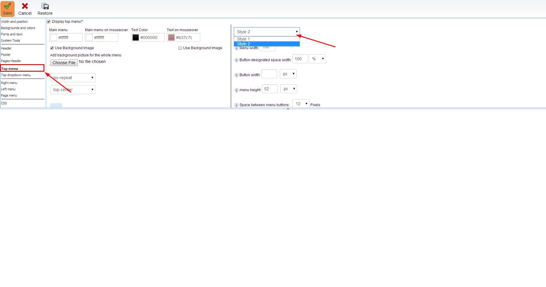
Owners of older websites, please note, that if your top navigation menu is built in accordance with Style 1, please switch to Style 2, otherwise the menu will not be adapted properly.
In case your website maintains multiple languages, the responsivity feature must be enabled for each language separately.
 
We keep developing and creating and we truly hope that you’ll benefit greatly from our new tools.
|
Click here to view further updates
|
|
|